Crochet Diagrams Versus Text for Patterns
A buyer reaches Round 18, pauses, and asks whether the next stitch goes into the chain or the first stitch of the round. That moment is where crochet diagrams versus text stops being a formatting preference and becomes a customer-experience decision.
For amigurumi designers, the goal is not to prove that one format is superior. The goal is to publish instructions that let a customer make your character accurately, confidently, and with fewer support messages. Text, diagrams, progress photos, and visual models each solve a different problem. The strongest pattern uses the right one at the right point in the project.
Crochet Diagrams Versus Text: The Real Decision
Text instructions are the working language of most amigurumi patterns. They explain stitch counts, repeats, shaping, color changes, assembly order, stuffing guidance, and the small decisions that turn separate pieces into a polished toy. A line such as `R12: (sc 4, inc) x 6 (36)` is compact, familiar, and easy for an experienced crocheter to follow.
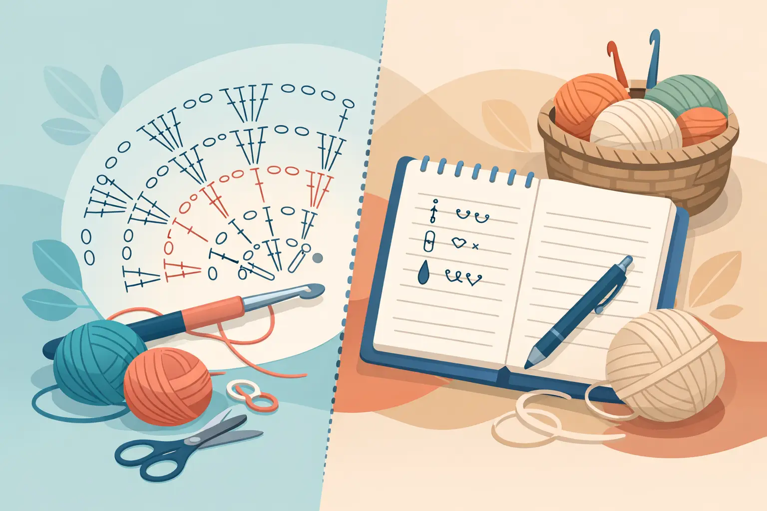
Diagrams make structure visible. They can show stitch placement, the direction of a row, the relationship between pieces, or a repeated motif without relying on long written explanations. In flat crochet, charts are often the main event. In three-dimensional amigurumi, they are usually more valuable as support material than as a total replacement for written rounds.
That distinction matters when you sell patterns. Your customer may be working from a phone, printing selected pages, translating terminology mentally, or returning to the project after a week away. They need information in the form that is fastest to understand at that exact step.
Text is usually best for sequential construction. Diagrams are usually best for spatial clarity. Progress images are often best for confirming that the work looks right. Treat those formats as a system, not competitors.
There is also a practical reason the choice is less either-or than it looks. A chart does not have to be drawn by hand as a second version of the pattern. A chart generated from your written rounds comes out of the same text you already typed, which means the two formats cannot disagree, and an edit to Round 12 does not leave an old diagram behind. The reason most patterns pick one format is the cost of maintaining both, and that is the part worth removing before you decide.
Where Text Instructions Win
Text gives designers control over details that a diagram can struggle to carry efficiently. Amigurumi is full of conditional decisions: insert safety eyes between specified rounds, shift a marker after a color change, leave a tail for sewing, or lightly stuff before the opening becomes too narrow. Those are instructions, not simply stitch maps.
Written notation also scales well across a pattern catalog. Once you establish consistent abbreviations, repeat formatting, round labels, and stitch counts, customers learn how to read your work. That consistency becomes part of your product quality. A buyer who successfully completes one of your patterns should feel more prepared to buy the next.
Text is especially effective for these parts of an amigurumi pattern:
- Round-by-round body, head, limb, and tail construction
- Color changes and yarn-cutting instructions
- Assembly placement and sewing sequence
- Stuffing, shaping, and finishing notes
- Options such as embroidered eyes, alternate colors, or removable accessories
The trade-off is cognitive load. Dense shorthand can feel efficient to the designer while becoming hard to scan for the customer. Long paragraphs can create the same problem in a different form. A clear pattern separates rounds, keeps stitch counts visible, and places special instructions directly where they are needed.
When a tester misreads text, the problem is not always skill level. It may be that the information arrived too late, used inconsistent terminology, or buried the action inside a crowded line. Testing is where this becomes visible.
Text needs a visual checkpoint
A text-only pattern can be technically correct and still produce customer uncertainty. For example, a buyer may complete every round of a curved snout correctly but wonder whether the piece should look shallow, oval, or slightly tilted. A progress image or 3D preview gives them a quick answer before they undo several rounds.
This is particularly useful at shaping milestones: after increases begin, before a piece is folded or joined, after a color block is completed, and before final assembly. The visual does not replace the written instruction. It confirms the result of following it.
Where Crochet Diagrams Earn Their Space
A diagram earns its page when it removes ambiguity faster than text can. Do not add charts because they look professional. Add them because they help the buyer make a correct decision.
Assembly diagrams are one of the clearest examples. Written instructions can say to pin ears between Rounds 9 and 15, six stitches apart, with the outer edge angled back. A labeled visual can show that placement immediately. The text can retain the precise measurements while the diagram gives the buyer orientation.
Diagrams also work well for surface details. A facial embroidery map, paw-pad placement guide, wing alignment sketch, or colorwork layout can prevent the most common question: “Which stitch do I use as my reference point?” For collectible character designs, these small details often determine whether the finished toy resembles the sample photo.
Use diagrams with extra care around spiral construction. A standard crochet chart can imply joined rounds when your pattern is actually worked continuously. If you include a round diagram, make the start position, stitch direction, marker location, and any intentional offset unmistakable. A beautiful chart that suggests the wrong construction method creates more risk than no chart at all.
Build for Different Customer Reading Styles
Your audience is not one type of crocheter. Some buyers read every line before they begin. Others work almost entirely from the repeat notation, checking photos only when something feels off. Some are comfortable with charts but prefer words for assembly. Others rely on visual references because English is not their first language.
That is why a hybrid pattern often has the strongest commercial case. The written pattern remains the source of truth. Visuals reduce friction at the moments where spatial interpretation matters most.
This approach also supports localization, and here diagrams have a genuine structural advantage. A symbol is not in any language. A designer writing rounds in Spanish and a maker reading them in Polish are both looking at the same chain and the same single crochet when the notation is symbolic, and we have seen designers write their patterns in symbol notation for exactly that reason.
That is not a reason to drop the words. Symbols still need labelled conventions, and assembly guidance, stuffing notes and the conditional decisions above do not reduce to symbols at all. It is a reason to know which parts of your pattern survive translation on their own and which parts need a translation that understands crochet terms rather than a general one. A translated pattern should not merely convert words. It should preserve the reader’s ability to understand sequence, placement, and intent.
For designers building an international catalog, standardized notation is an operational advantage. Keep abbreviations consistent, define them once, and avoid informal phrasing that is difficult to translate. Then use visuals to reinforce the elements that could otherwise require lengthy explanation in every language.
Make the Format Match the Project
A small sphere with embroidered cheeks does not need the same documentation as a dragon with articulated wings, layered spikes, and a wired tail. The complexity of the object should guide the complexity of the pattern presentation.
For a beginner-friendly plush, prioritize clean text, stitch counts, several progress photos, and a simple assembly guide. Too many charts may make the pattern look harder than it is. For an intermediate or advanced design with unusual joins and multiple components, add targeted diagrams where construction becomes difficult to describe in a sentence.
Ask a practical question at every stage: if a capable buyer follows this instruction literally, can they tell whether their work is correct before they move on? If the answer is no, add a better explanation, a visual checkpoint, or both.
This is also where working from one source changes the decision. In Amigurumake the rounds you write are the input for everything else: the piece appears in 3D as you type it, the symbol chart is generated from the same rounds, and the PDF is exported from them too. Nothing is drawn twice, so adding a diagram costs you a decision rather than an afternoon, and the diagram cannot fall out of step with the text later.
Seeing the piece also tells you where a diagram is worth adding. The places you hesitate while looking at the model, an increase round that shapes a curve, a fold, a join, are usually the same places a buyer will hesitate while making it.
Use Testers to Decide What Belongs in a Diagram
Do not guess which instructions are clear. Let testers show you. When multiple testers ask the same question, flag the exact point in the pattern rather than treating each message as isolated feedback.
If testers repeatedly misplace a feature, add a placement diagram or a labeled photo. If they lose track of a repeat, revise the text formatting first. If they complete the piece correctly but doubt themselves, add a progress reference. The right solution depends on the failure point.
Tester feedback can also reveal when a diagram is overdoing the work. If testers ignore a full stitch chart and rely on concise round text, the chart may be adding pages without adding confidence. Your PDF should feel polished and helpful, not crowded.
Track the questions that affect completion time, correction work, and buyer satisfaction. Those are the issues worth solving before you publish. A well-tested pattern protects your time after the sale as much as it supports the customer during the project.
Design a Pattern Buyers Can Finish
The best choice in crochet diagrams versus text is rarely either-or. Use text to direct the making. Use diagrams to clarify space, placement, and unusual construction. Use photos or visual previews to reassure buyers that the shape is developing as intended.
Start with the step most likely to make a customer hesitate. Make that one step easier to read, easier to check, and easier to finish. Small clarity improvements there can turn a good-looking pattern into a product buyers recommend.
Common Questions
Should an amigurumi pattern use a diagram or written text?
Written rounds should carry the construction, because amigurumi is sequential and full of conditional instructions such as when to insert eyes or how much to stuff. Diagrams are worth adding where space matters more than sequence: placement, orientation, surface details and unusual joins. Most strong patterns use both, with text as the source of truth.
Do crochet charts work for amigurumi at all?
Yes, with one caution. A standard round chart implies joined rounds, and most amigurumi is worked in a continuous spiral. If you include one, make the start position, the direction, the marker and any offset unmistakable, or the chart will suggest a construction method your pattern does not use.
Does adding diagrams mean maintaining two versions of the pattern?
It does when the chart is drawn separately, which is the real reason most designers skip it. A chart generated from the written rounds is not a second version: it comes from the same text, so an edit to one cannot leave the other stale.
Are symbol charts easier to translate?
The symbols themselves are language independent, which is why some designers write in symbol notation on purpose. But a pattern is more than its stitches. Assembly order, stuffing notes and conditional instructions still need words, so a translated pattern needs both a chart that travels and terminology handled by something that knows crochet.
How do I know which steps need a diagram?
Let testers show you rather than guessing. If several testers place the same feature wrongly, that step needs a placement visual. If they lose track of a repeat, fix the text formatting first. If they make it correctly but doubt themselves, they need a progress image, not a chart.
Can too many charts hurt a pattern?
Yes. A beginner-friendly plush covered in charts looks harder than it is, and pages that testers skip add weight without adding confidence. Add a diagram where it removes a specific ambiguity, not to make the PDF look professional.